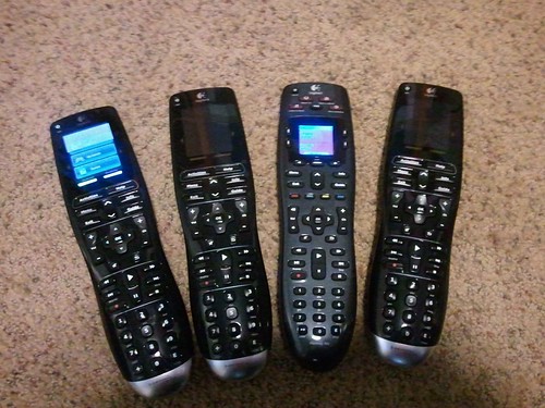
From left to right.
- Our first Harmony One. 1.5 years after purchase the screen went bad with a well documented white line problem. Logitech, providing great customer service, sent a free one time replacement for an out of warranty device.
- Our second Harmony One, the free one time replacement, stopped charging within 2 months. Another well documented issue. Because it replaced of an out of warranty product Logitech won’t do anything about it. We decided to try Harmony 700 hoping it would be more reliable.
- Our first Harmony 700. While good, the build quality is not One caliber. Disappointingly, after about two weeks of use, it started making a weird noise when picked it up. It’s like a screw or something is loose inside somewhere. It still functions perfectly though.
- We prefer the quality and feel of the One so much we sprung for our 3rd Harmony One.
The 700 isn’t bad. It has rubber backlit buttons that are easy to push and it feels ok when held. While not perfect, the 700 has a few advantages vs. the One. The price of the 700 relative to the price of the One is a big draw for some. The other advantage is a larger set of “hard” buttons. There are four Activity buttons at the top and four colored assignable buttons in the middle. We didn’t really find the need for the extra buttons.
The One has a touch screen, which can be seen as an advantage or disadvantage. I prefer it. However, our favorite thing about the One vs. the 700 is the charging station. The 700 uses a dongle, like a cell phone. The One has an aesthetically pleasing, easy to use, docking station. Set it and forget it.
I’m not sure what the point of this post is, but I wanted to get it out there. It’s part love part disappointment with Logitech; part Harmony One vs. Harmony 700. Moral of the story? Get a Harmony One and an extended warranty.
P.S. - Before owning either the 700 or the One we had a 720. Although it has all the functional Harmony goodness the ergonomics aren’t satisfying. Square form factor for a candy bar remote sucks.